
How to Prepare Your Artwork for Perfect Print Results
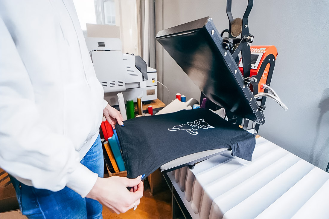
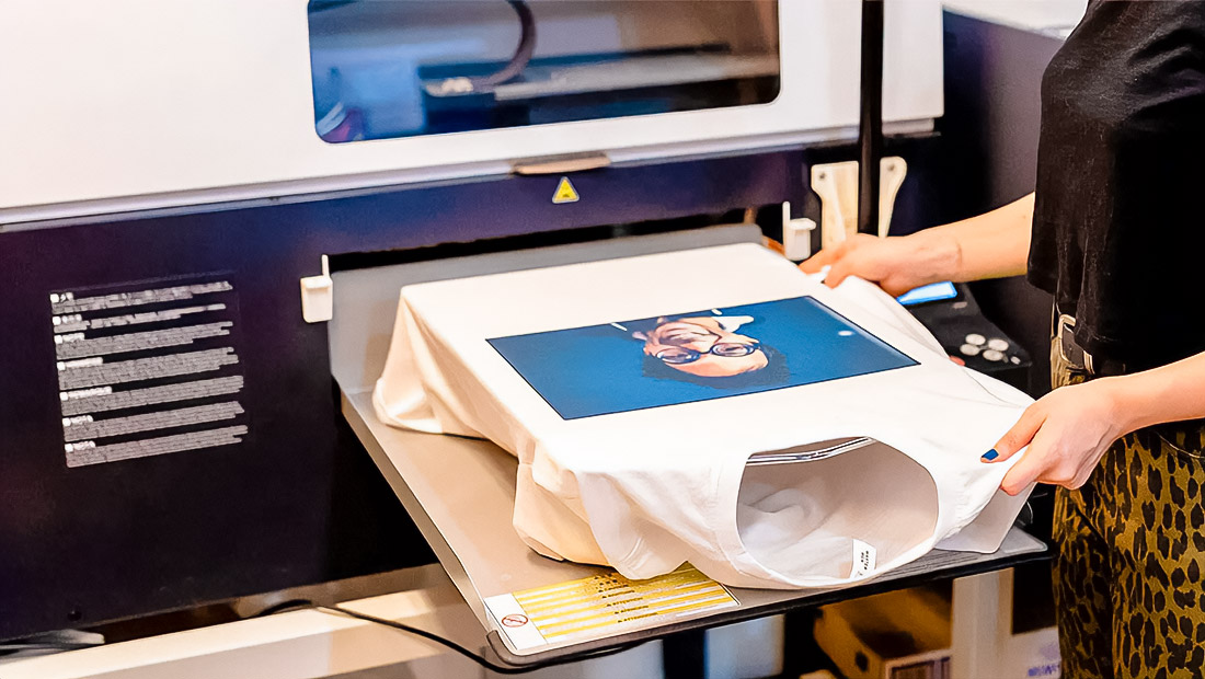
A high-quality print is not born by chance. The print layout is carefully assembled, checked consistently, and exported consciously. An error in one parameter breaks everything: the color floats, the font is replaced, the edges are cut crookedly. Next, we’ll organize the key steps and embed the exact numbers so that the result matches expectations up to each point. The same precision applies when preparing designs forDTF printing, where accurate profiles and dimensions are equally essential.
Color And Profiles: We Say Exactly
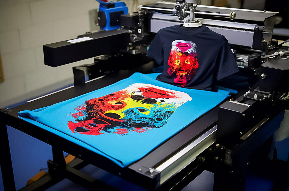
The printed file is prepared in the CMYK color model, not RGB. Otherwise, saturated shades turn into dull spots after conversion. For stability, they use the ICC profile, monitor the calibration of the monitor, and make test prints. The sRGB and Adobe RGB profiles (1998) are applied to the task: the first is more versatile, the second is broader in scope and useful for complex gradients. It is safer to print text on a layout in pure 100% K, and assemble solid dark backgrounds as rich black 20/20/20/100. This recipe improves the uniformity of fillings and avoids gray dips.
Dimensions, Resolution, Geometry: Counting In Advance
Resolution is the foundation of detail. For standard printing, they take 300 dpi, and for large-format materials, 150 dpi is acceptable at a distance. Recalculation of the dimensions is required: the A3 sheet has 11.7 x 16.5 inches, therefore, at 300 dpi, a canvas of approximately 3510 x 4950 pixels is needed. The A5 format is 148 x 210 mm, and with a span of 3 mm on each side, the page size becomes 154 x 216 mm. Departures are always made: 3 mm around the perimeter or 0.125 inches as the equivalent. Important elements are kept in a safe field of at least 5 mm from the cutting line. Edging marks must be added so that the carver does not guess at the edge of the illustration. For products with a limited application area, the actual printing window is taken into account: 12″ x 16″ for standard tasks and up to 15″ x 18″ for enlarged formats. This way, the image will not go under the edge, will not fall into the “dead zone”, and will not stretch in jerks.
Export, Fonts, Control: We Bring It Up To Standard
The transmission format is PDF, preferably PDF/X-4:2008 or PDF/X-1a standards. The first one works better with transparency, the second one is reliable for classical streams. Before exporting, each image is checked at 300 dpi, making sure that there are no extra RGB objects inside the file. Fonts are embedded or translated into curves so that the output system does not replace the typeface. For small text, avoid compound black, and keep 100% K to sharpen the edges. Gradients are kept 16-bit until the final rendering, if possible, which reduces banding on smooth transitions. Preflight is required: check the departures, labels, ICC profile, page format, number of pages, absence of hidden layers. And only then we export it to the final PDF.
A couple of practical notes saves money and nerves. If a frame is planned, we take into account the total canvas in advance: a 10″ x 8″ image plus a 1-inch frame gives 12″ x 10″. If the project is designed for large stands, do not be afraid of 150 dpi at a reasonable distance this is normal and justified. If you need a rich background, make it rich black 20/20/20/100, but leave the thin text pure K, otherwise the printing house may get a spread through the channels. And most importantly, start the document with the correct parameters: page format, 3 mm span, 5 mm safe zone, CMYK color model, ICC profile, target resolution. Then the printed file will enter the stream without surprises, and the result will match the screen design as closely as possible.